Seedr V2 — a first look at the new UI
Seedr V2 is a full UI rebuild. Lighter layout, separate tabs for different jobs, grid or list views, and better filters. This is a tour of what changed and where to find each feature.
Why we rebuilt the UI
V1 grew feature by feature. Every new capability added another button or panel to the main screen. By the time we shipped player upgrades and task management, the home view carried more information than most users wanted on first glance.
The V2 rebuild had three goals:
- One job per tab. File browsing, task management, and activity each get their own space.
- Fewer elements on screen at once. Advanced filters and seldom-used options live behind menus instead of on the main bar.
- Responsive by default. Mobile isn't a pared-down version; it's the same layout adapted.
What changed
Separate tabs
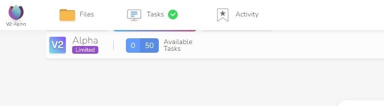
The top-left of the window now holds three tabs:
- Files — your folders and content, the main browse view.
- Tasks — every active and recent download. See the Tasks page article for the detail.
- Activity — a running log of account actions (coming soon).
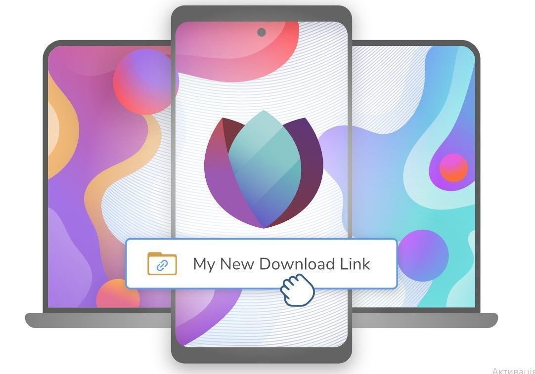
Before V2: tasks, files, and activity were all on one screen. After V2: pick the tab, see only what that tab is for.
.jpg)
Grid view
The Files tab now has a grid/list toggle. Grid view shows files as thumbnails — useful when you're looking for a video or image by cover art rather than filename.
- List view: filename, size, date, type. Dense, sortable.
- Grid view: thumbnails, larger clickable area, better for media.

Filters
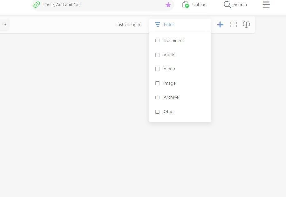
Filters are both standalone and baked into the main bar:
- Type: filter by file category (video, audio, document, archive, image).
- Date: modified ranges.
- Size: over/under thresholds.
- Name: substring match.
You can combine them. The filter panel is collapsible so it's only on screen when you're using it.
Duplicated controls
A small but deliberate choice: common actions (filter, sort, view switch) appear in more than one place. On a wide desktop screen, one copy is near where your cursor already is. On mobile, another copy is in the sticky bottom bar.
This is redundant by design — it shortens the distance to the control regardless of where your hand is.
Lighter, brighter — and dark mode
The V1 palette was heavier and denser. V2 uses more whitespace and a lighter base. Dark mode is live — toggle it from the profile menu if you prefer a low-light palette.
How to use it today
- Log into Seedr and open the V2 interface (from the waitlist or as a Premium member with priority access).
- Start in the Files tab to browse.
- Use the grid/list toggle (top-right of the file list) to switch views.
- Open Filters to narrow by type, date, size, or name.
- Switch to Tasks to monitor downloads.
Everything is reachable from the main navigation. There are no hidden menus for primary features.
What's still coming
The V2 UI is live but not finished. On the list:
- Activity tab. Tab exists; content logging is being built.
- Smart Search. Content-based search across files (today search is filename-based).
- Wishlist. Save files or links for later download.
- External storage bridges. Connect Google Drive or OneDrive and browse them inside the Seedr UI.
These are announced, not shipped. We flag them because a few are visible as placeholder tabs or icons in V2 today.
Limits worth naming
- Some V1 power-user flows (keyboard shortcuts, batch operations) are reduced in the V2 alpha. They're returning.
- Custom sort orders don't persist across sessions yet.
- Mobile landscape mode has layout issues on narrow tablets.
We're tracking these and patching them in point releases.
Wrap
V2 is cleaner, tabbed, responsive, and deliberately lighter on visible controls. The trade-off is that a few V1 habits need relearning. Most users adapt inside a session.
For more on the UX improvements specifically, see how the new UI enhances the user experience.
Was this article helpful?
Related Articles

We’ve Increased Storage Across Plans
We’ve increased storage across Seedr plans — up to 5x more space, more flexibility, and fewer limits.

Seedr Google TV app: try it before the open beta
Seedr’s Google TV app launches next week. Try the beta early, stream your videos on TV without casting, and watch in up to Full HD and 4K with Premium.

Merge PDF files online — free and no software needed
Combine multiple PDFs into one clean document in seconds. This piece explains when that actually matters (visa forms, job applications, client proposals, monthly admin), how to do it in Seedr with a simple upload–select–reorder–merge flow, and why it’s different from typical online tools that add watermarks, size limits, or signup walls. Instead of dumping a merged file onto your device, Seedr keeps it in your cloud—private, accessible from anywhere, and sitting alongside your other documents, media, and archives so you are not juggling five separate apps.